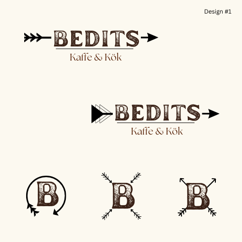
I worked with a new restaurant to create a logo design for their business. The theme of the restaurant is rustic/western style. One look they liked and felt fit their vision was the name branded into wood. I started off by creating 5 unique designs relating to their restaurant theme. Leaning into fonts that had the look of being burned into wood, like their inspiration. I also chose a couple of fonts that fit more of a rustic chic vibe and old-west style to add variety.
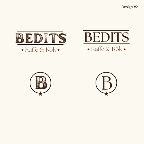
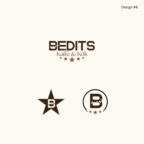
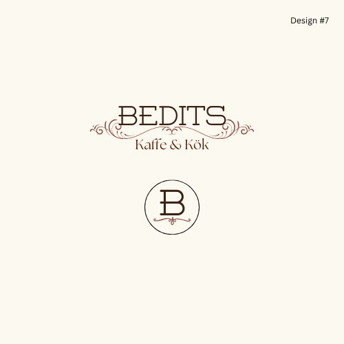
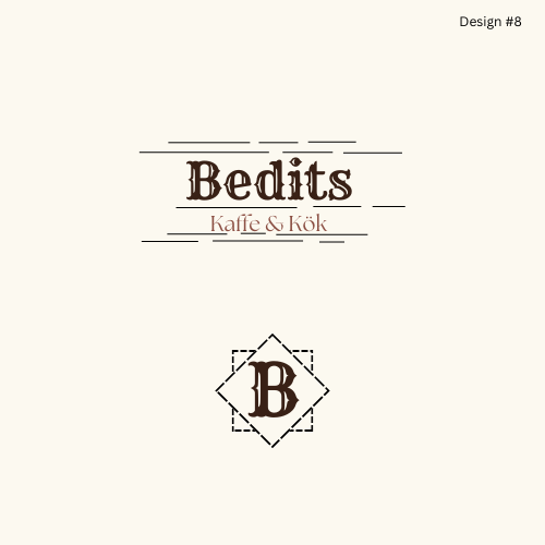
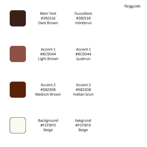
This was a guide to the colors I had used in the original designs
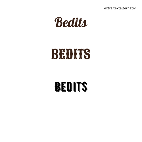
These were some examples of alternative fonts I had found that could also go with the style and theme of the restaurant.
From the initial designs, we chose 3 (designs 2,7, & 8) that we were really interested in and made some changes to the styles. We also took the font from design #1 and added it to several of the designs.
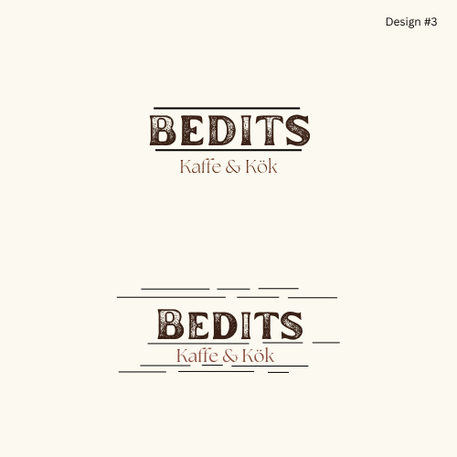
They wanted to see the font from the original design #1 in this style.
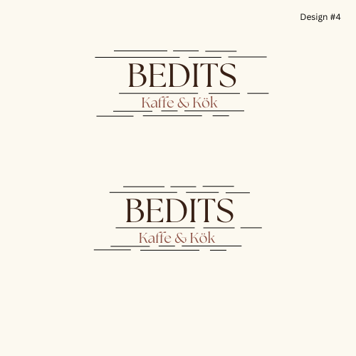
They wanted the lines cleaned up a bit with this design.
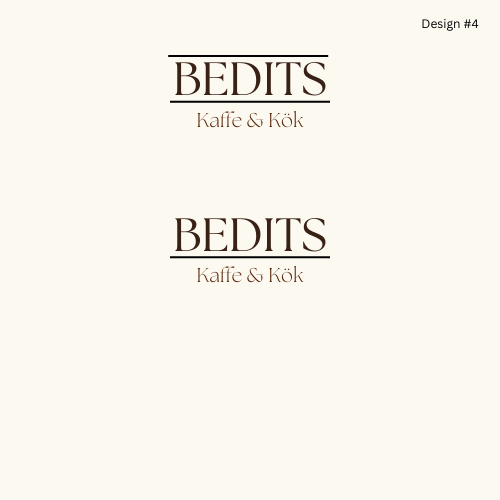
They asked to see this design without the stars around 'Kaffe & Kok'
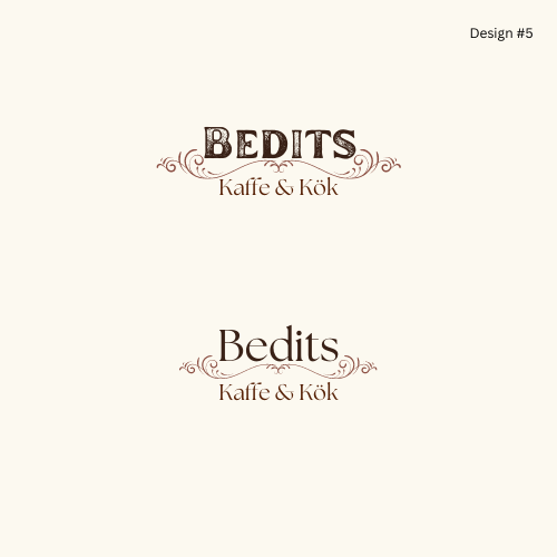
They wanted to see this design in different fonts.
After settling on the final design, we wanted to see the design laid out over a picture of wood texture for possible menus and signs. Here, I played around with placements of the logo on the pictures, as well as, the color of the logo and transparency of the photo.
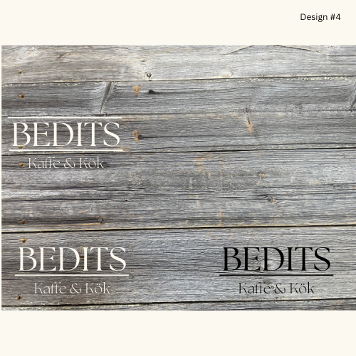
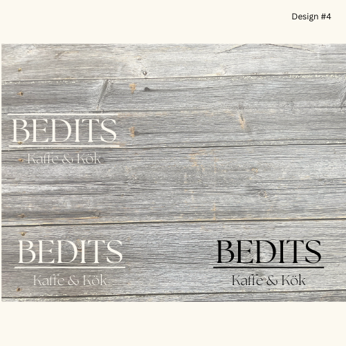
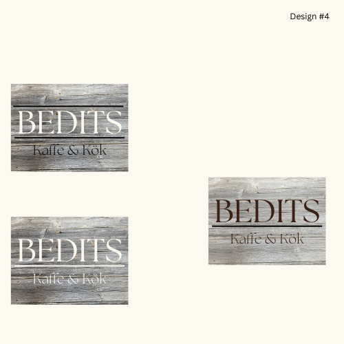
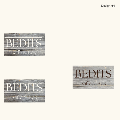

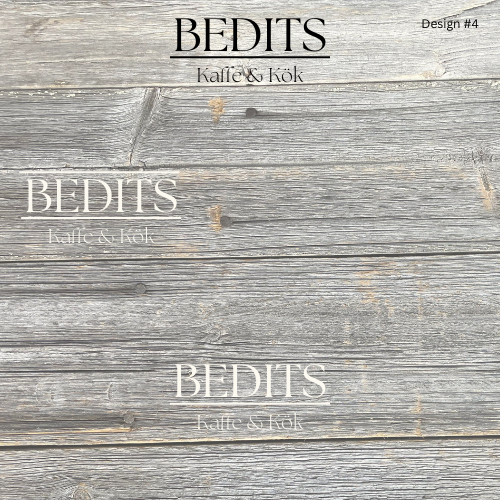
In the end, we decided on a simple black-and-white color scheme. As we felt that could easily be translated onto staff uniforms and in marketing. We thought this logo suited their new business the best as it was simple but the lines still added character to the text. We also felt it was versatile and could be used in many different ways to fit their new business.


